Golden Properties
Real estate app helping buyers to select property matching their needs and inspire for new beginnings
Design brief
Design objective
Develop a fully rounded UI to ease the complexity of finding the right property while providing an enjoyable experience.
Technology criteria
A responsive web app (mobile-first approach). Provide a full set of responsive screens from mobile to desktop HD resolutions.
Client
This design concept was created for study purposes and can be tailored for an app per request.
Time
6 weeks (year 2020)
MY ROLE
Solo UX and UI designer from concept to high-fidelity prototypes with a focus on UI elements
TOOLS
Sketch, Whimsical, inVision, Flinto, Zeplin, Usability Hub
TECHNIQUES
User flows, wireframing, prototyping, preference testing, logo and Icon development, design system and style guide
User persona
The design brief provided one key user persona, representing the target user group of young to mature, well-educated, tech savvy professionals, looking for a new home or investment opportunities to secure future prosperity.
Meet Rachel
Rachel, an IT consultant at a thriving tech firm, navigates a hectic schedule balancing her demanding job and bustling home life.
With the recent addition of house hunting, she finds it challenging to juggle everything seamlessly. Amidst the chaos, Rachel seeks a solution that can simplify the house searching process. This tool should empower her to find her dream home without adding extra burdens to her already tightly packed schedule.
Rachel's motivation for finding the perfect home extends beyond mere convenience. She aims to invest in property to bolster financial security for her family.
In her quest, she prioritises access to accurate and timely information to facilitate swift decision-making.
“I want to provide my family with financial security.
I’ve been considering buying property for a while, and am looking for a tool that can help me find what I’m looking for, quickly!”
User flows
Based on the given brief of user needs, I devised a diagram to reflect relevant user flows to allow users to:
Create a profile containing property criteria
Search and filter properties
Save or mark properties
Access comprehensive information about properties
See how well a property meets user criteria or compares to other properties
Contact property sales consultants
Moodboard
I made 2 moodboards in search of a fitting theme for our user persona Rachel.
Rachel lives with her family in a city on the east coast, and spends most weekends in the countryside. She likes hiking with her family, and playing basketball with old colleagues.
Through investment in real estate she wishes to secure financial prosperity for her family.
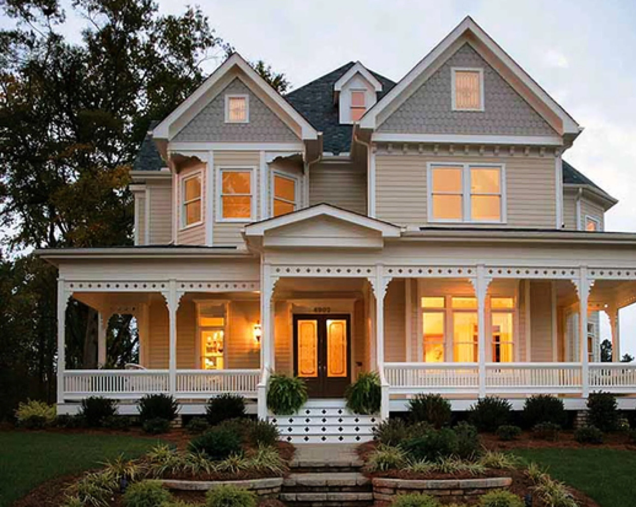
HERITAGE
MODERN PROSPERITY
The brief focuses on buyers whose main focus lies on investing for additional income or financial security and not that much for a primary home for their own use.
Even though the traditional value and Heritage mood also conveys legacy intention, I felt the visual direction put on Modern Prosperity mood board would be more appealing to the user group of younger and tech savvy professionals, while also instilling the hereditary notes through patterns and typefaces.The brief focuses on buyers whose main focus lies on investing for additional income or financial security and not that much for a primary home for their own use.
Even though the traditional value and Heritage mood also conveys legacy intention, I felt the visual direction put on Modern Prosperity mood board would be more appealing to the user group of younger and tech savvy professionals, while also instilling the hereditary notes through patterns and typefaces.

Style guide
Colour palette
Typography
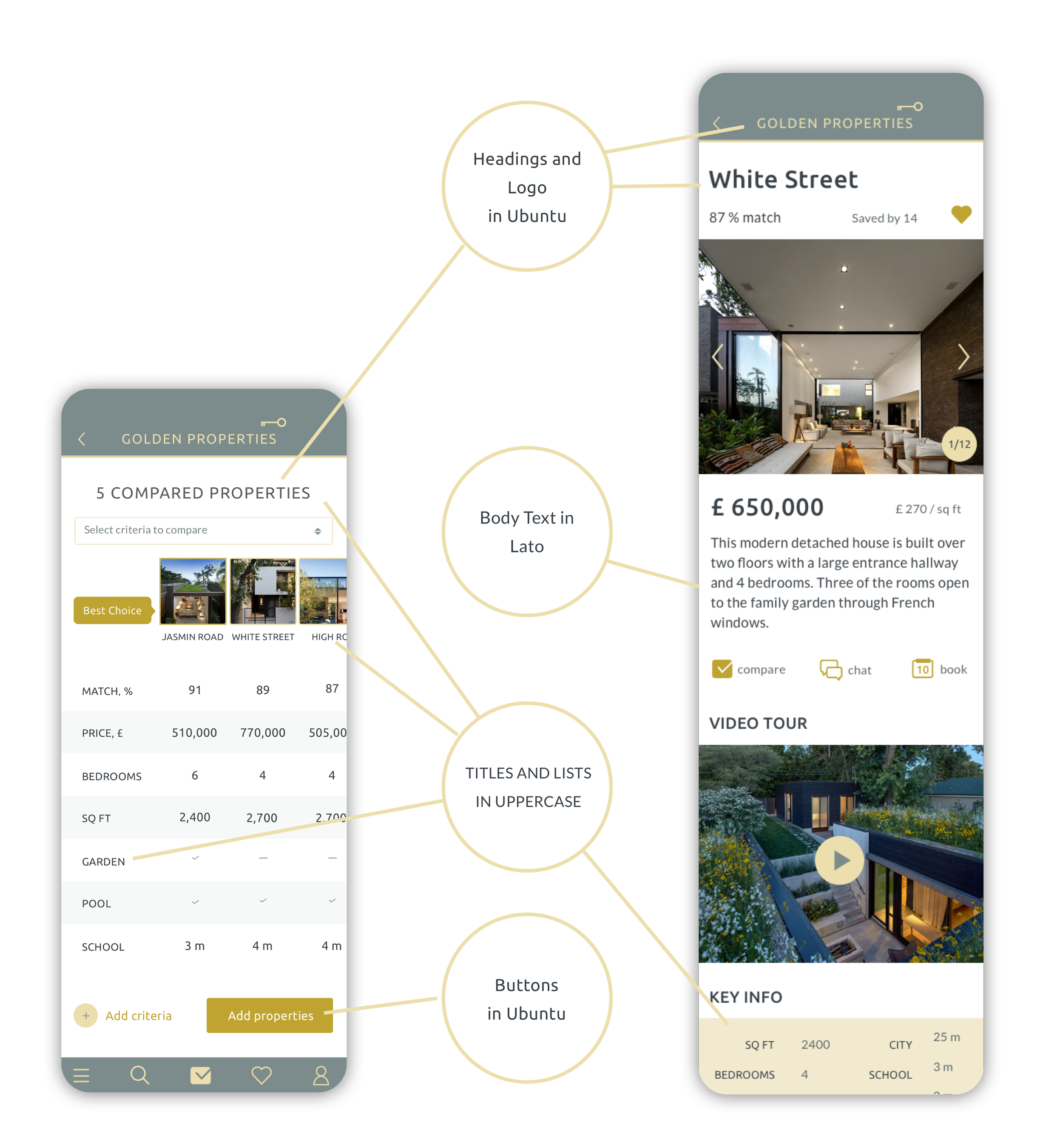
I sought an elegant, modern typeface to convey quality and style. After exploring options, Ubuntu perfectly captured the desired mood with its sophisticated yet contemporary aesthetic. To enhance visual appeal, I integrated Lato, known for its clean design and readability. The combination created a seamless composition exuding elegance and modernity while ensuring legibility across platforms. Sentence case mixed with uppercase and selected sizes achieved an effective content hierarchy, directing focus towards key information.
Buttons
Logo
For the logo design I leveraged a typographic strategy using the brand's gold colour palette. Incorporating the key element into the design serves as a symbolic representation of the property and signifies future prosperity.
Responsive logo design options
Proportions and spacing
Imagery
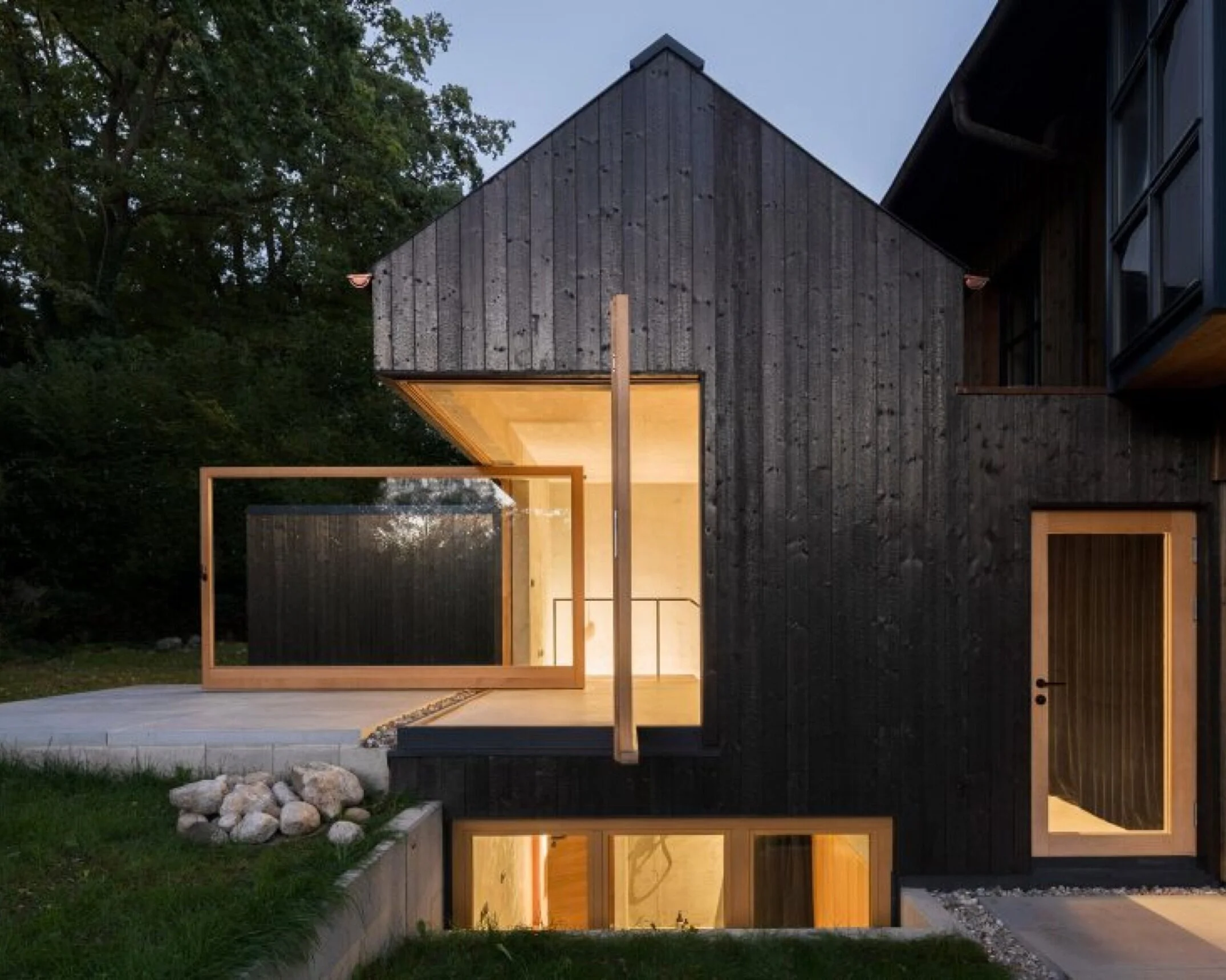
As images make a huge difference on the design, I paid special attention to make a great selection. I wanted to make sure images evoke the motivation to search for an appropriate property and provide an inspiration of future real-estate ownership. They should also make the journey visually pleasant.
The app imagery should instill the modern and light notes.
Emphasise architectonic forms
The house in the centre to make an impression
Clear skies, lit up, in crisp and clean views
Confident people to help to create motivation to act
Show layout and structure of interiors
Inviting, tidy places
Create a feeling of being there
Design evolution from low to high fidelity
To cater for the needs of the target user group, who are mostly on the go, I assumed a mobile-first approach. The first ideas were put together using Whimsical wireframing tool with high-fidelity designs in Sketch.
As the final step, I worked on further breakpoints for different viewports providing users with more options and convenience on larger screens. Fluid design was found fitting in most cases, while I applied layout shifter for Search page to ensure better usability and effective layout.
Layout design and spacing
Grid system
12-column layout, based on 8pt step
Desktop and Tablet: gutter 24pt
Mobile: gutter 8pt
Prototype


