
Let’s clear the pixel confusion
Is 320px still a thing?
Ever looked at your analytics and seen users on 320px screens and thought, "Wait... who even has a 320px wide phone in 2025?"
The confusion is real, but it’s not what it seems at first glance.
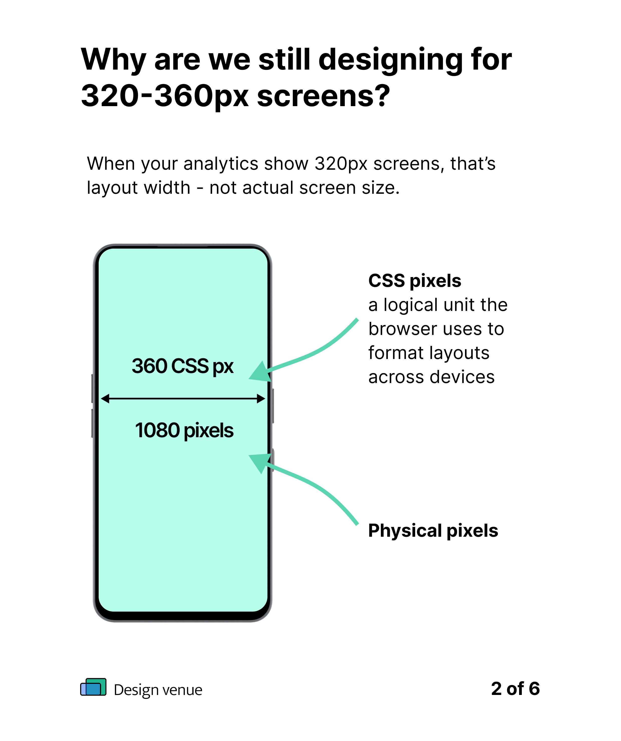
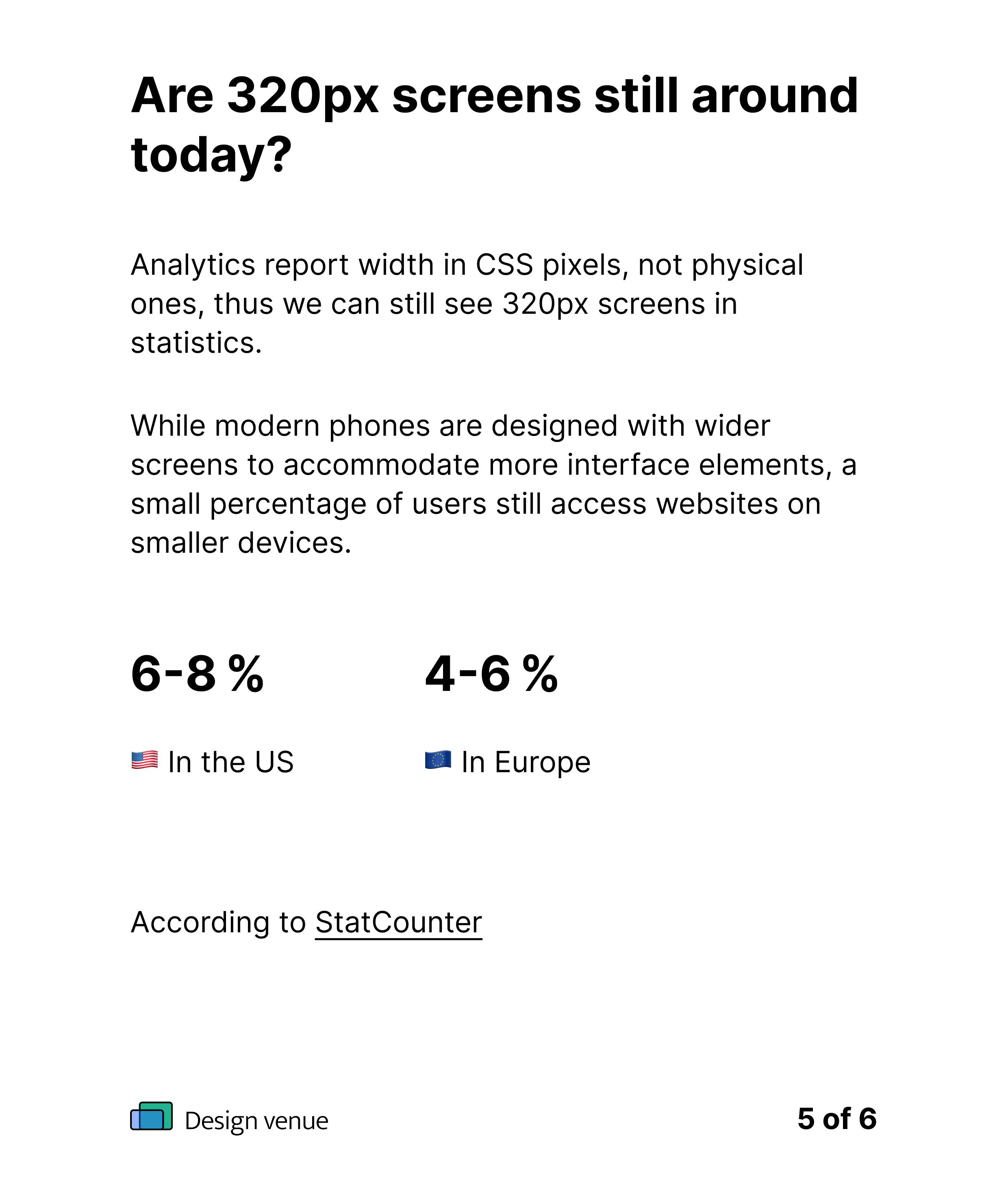
The “320px” we’re seeing in tools like Google Analytics isn’t physical pixels. It’s CSS pixels, a logical unit that the browser uses to scale layouts regardless of the screen’s actual resolution.
While 320px screens are mostly a thing of the past, they’re still used by a small segment of users.
For product designers committed to accessibility and delivering the best experience for all users, it’s important not to overlook them entirely.
According to StatCounter, as of 2025:
In the US, devices with screen widths between 320px and 360px still account for about 6 to 8% of mobile web traffic.
In Europe, it’s slightly lower, but still relevant, around 4 to 6%.
So, yes, it’s a small slice, but millions of sessions still occur at these narrow widths.
But the point is that the points per inch, that is, the physical resolution of a screen isn’t what we see in our design tools or analytics.
Pixels vs dots vs resolution
When I first dove into the world of UX design, I found myself lost in a maze of all the units that are all not quite the same thing: pixels, points, dots, pixel density, screen resolution, fluid, responsive design, scaling, rems, ems… it is a bit like a secret language and can get quite confusing.
As screens continue to evolve and become increasingly high-resolution, it’s worth revisiting these concepts and understanding how they impact modern design decisions.
Let us zoom in on those pixels a bit
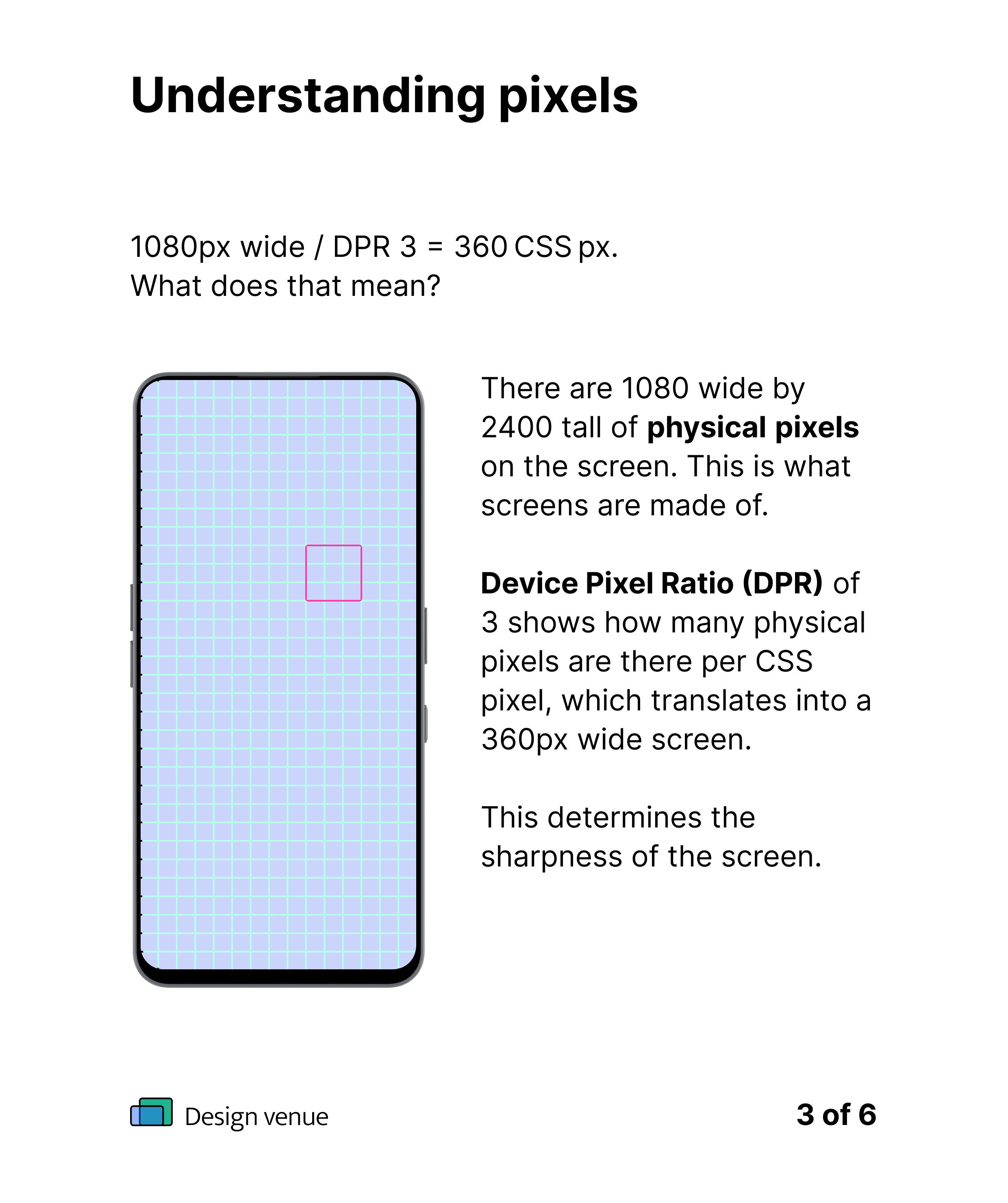
First, we have the obvious: physical pixels: the tiny hardware dots that make up our screens. These are the real, tangible building blocks of any display and define a device’s screen resolution. For example, a phone with a resolution of 1080 × 2400 has 1080 physical pixels across its width.
As designers, however, we should mostly care about the CSS pixels or layout pixels. These are abstracted units that allow us to design consistently across screens with different pixel densities.
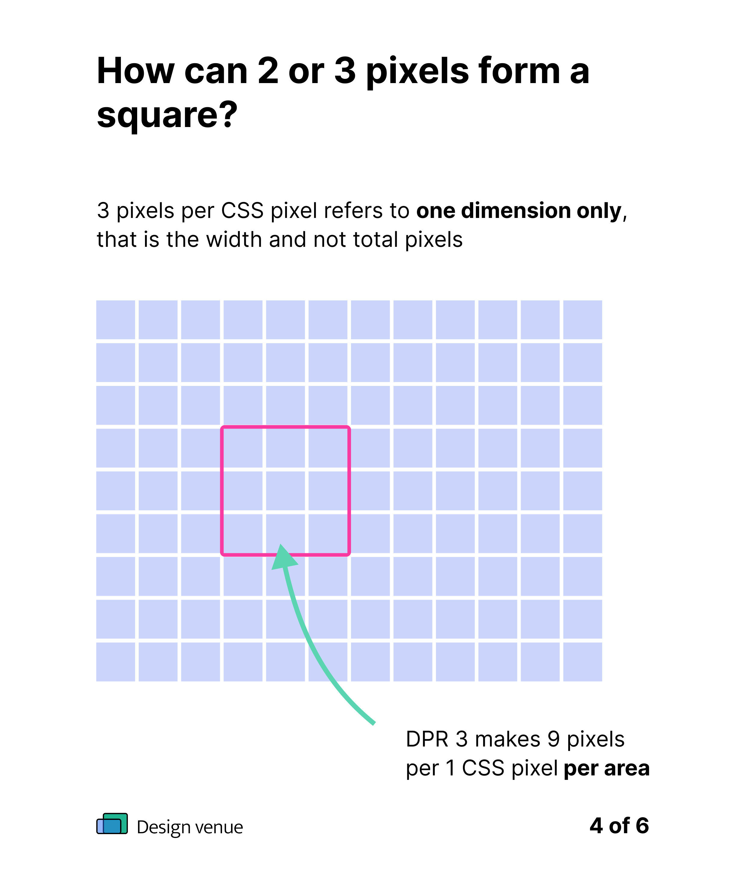
Modern phones often have high pixel density, meaning multiple physical pixels are packed into a single CSS pixel. That’s why a phone with a 1080px-wide screen and a device pixel ratio (DPR) of 3 will appear as just 360px wide in your browser’s analytics.
In essence:
Physical resolution tells you how many actual pixels are on the screen.
Phone size tells you how big that screen is physically (e.g., 6.1 inches).
Pixel density (PPI / DPR) bridges the two, affecting how sharp the screen looks and how a design scales, where Pixels Per Inch affects sharpness and clarity and Device Pixel Ratio showing ratio of physical to CSS pixels. affects how things are scaled and rendered on different screens.
Here are a few popular phone models and their parameters tying it all together.
Phone model
iPhone SE
iPhone 13
iPhone 15 Pro
Samsung Galaxy S22
Galaxy S22 Ultra
Screen size (in)
4.0″
6.1″
6.1″
6.1″
6.8″
Resolution (px)
640 × 1136
1170 × 2532
1179 × 2556
1080 × 2340
1440 × 3088
Viewport (CSS px)
320 × 568
390 × 844
393 × 852
360 × 780
384 × 824
Density
(Pixel ratio)
2
3
3
3
3.75
Devices like the iPhone 15 Pro have higher physical resolution, but the design space (CSS pixels) changes only slightly. Supporting 320px layouts ensures backward compatibility, while 360–414px is the sweet spot for most modern devices.
Summary for designers
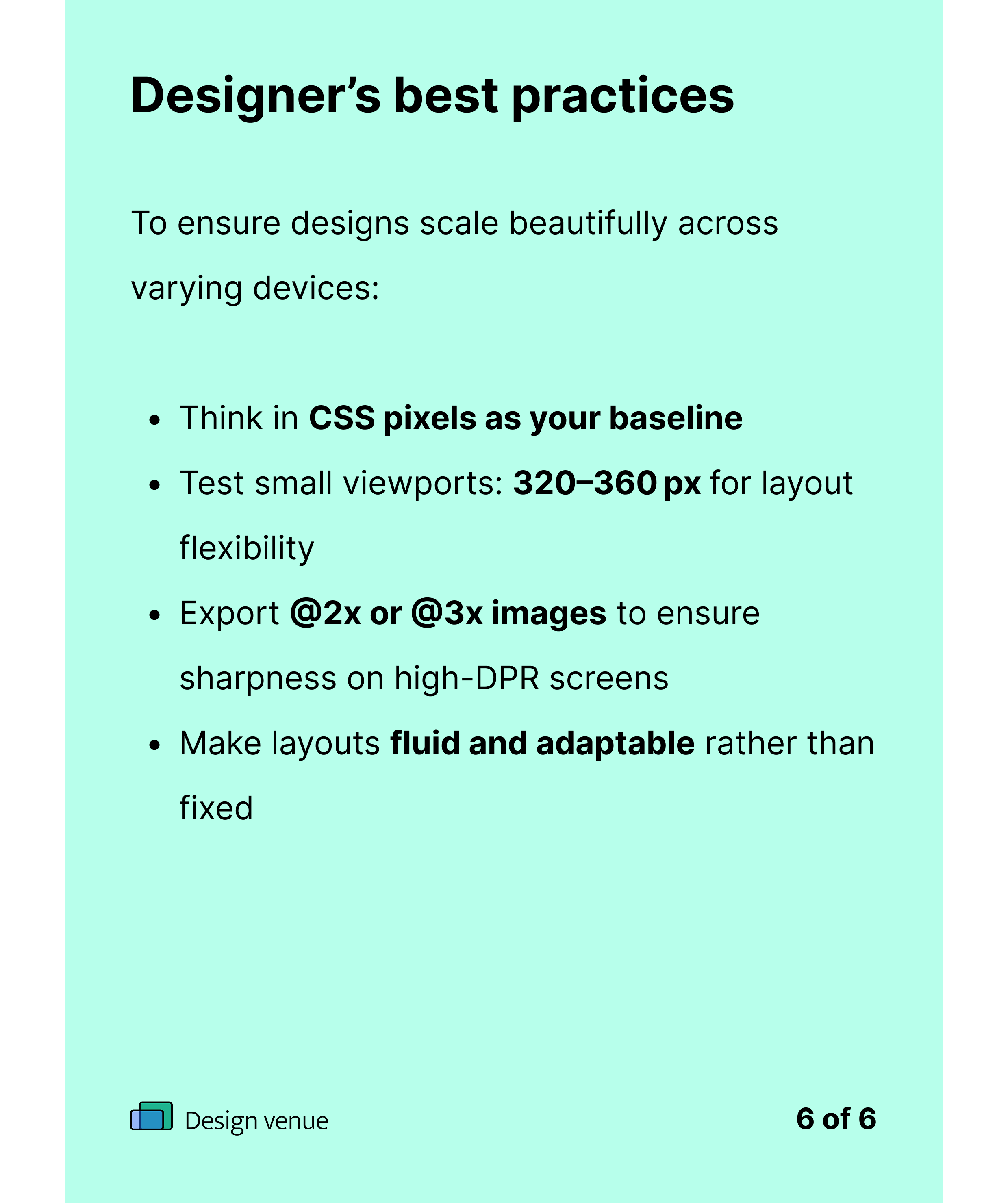
In summary, follow these rules and your designs will look clean and work great anywhere - from budget phones to ultra-HD monitors.
Design in CSS pixels - they’re the consistent, virtual units browsers use.
Browsers scale layouts to match the device’s DPR, so your design stays readable on high-resolution screens.
Test small viewports (320 to 360px) - not for screen size, but for layout space.
Export images at @2x or @3x - so they stay sharp on high-density displays.
Think scalable, not fixed - layouts should adapt across screen sizes and resolutions.
At the heart of good design is understanding - not only of the user needs and business goals but also of the fundamentals behind what we see in our tools. Knowing the difference between physical and CSS pixels, and how device pixel ratios affect layout, gives us the clarity to design for the real experiences people have across devices.